Changing Covers
|
The Catcher in the Rye has featured different covers over the years. The different covers represent different editions.
“An edition is the total number of copies of a book printed at the same time in a particular way using the same set of tools (i.e., metal type, digital printer). Popular books may run multiple editions using the same settings with few changes. These are each known as printings. The book may have subsequent impressions where the book is not changed," (Lamb). |
|
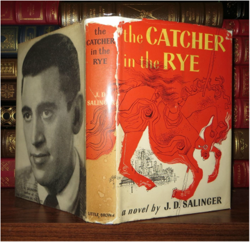
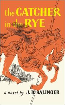
The first edition of the book featured the famous reddish orange carousel horse that evokes a pivotal scene in the final part of the book. The first and second printing of the book featured a photo of Salinger on the back of the dust jacket.
"Salinger loved the design his Westport friend Michael Mitchell created for the cover of Catcher: a raging, red carousel horse. A haunting photograph of Salinger appeared on the jacket photograph of the first and second printings of The Catcher in the Rye. By the third printing, Salinger expressly requested that Little, Brown remove his picture form the books,” (Shields).
"Bibliographers generally consider all printings from the first type setting to be first editions. However, book collectors consider only the first printing to be the first edition. The second and subsequent editions are numbered in the order that they are published. A new edition indicates that the book has been revised or expanded. When studying a book, it's important to examine all of the editions because useful insights can be gained by looking at what has been deleted and added for each edition,” (Lamb).
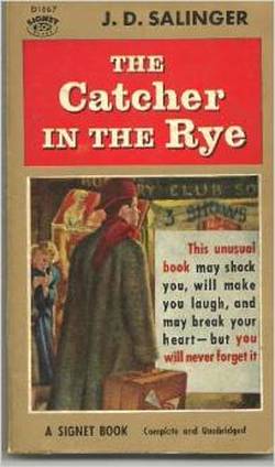
The 1953 edition featured an illustration of Holden on the cover. Salinger was not happy and did not want his character depicted. James Avati, the illustrator, argued that ""Mr. Salinger felt that since he had not described Holden in physical detail his face should not appear on the cover. We always had that problem. It is, in fact, quite frequently the core of our cover thinking, to the extent that it is the resolution of personality as expressed by some graphic device that makes up the cover. We try to find a way of conveying the mood of the book rather than describing some particular scene. Within reasonable limits it has proved true that physical characteristics are of much less importance than reactions expressed,"" (Gurney).

|

|
The rumor is that Salinger had a clause in his contract that specified what the covers of this books could contain. "In the 1950s Salinger had a clause put in his publisher’s contracts that insisted only the text of the title of the book and his name were to appear on any future editions of his work, and absolutely no images," (Pieratt).
Salinger wanted the books to speak for themselves. The simplicity of the covers leaves it up to the reader to imagine the characters; Salinger was not one for theatrics. |
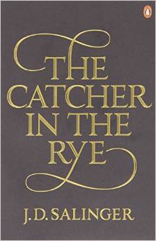
"Simon Prosser, publishing director, Hamish Hamilton: "There are strict rules about JD Salinger's covers. The only copy allowed on the books, back or front, is the author name and the title. Nothing else at all: no quotes, no cover blurb, no biography. We're not really sure why this is, but it gives you definite guidelines. Last year we decided it was probably time to re-design the covers, and we wanted a unique typeface that stood out. We commissioned Seb Lester, the highly regarded type designer, to hand-draw a font; that font, on the cover of these re-issues, is a one-off and is known in-house here at Hamish Hamilton as the 'Salinger,'" (Exclusive).

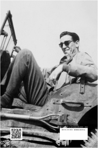
On a side note, the biography Salinger was published in 2013. The cover is very reminiscent of The Catcher in the Rye plain maroon cover. The cover would draw the eye of fans of Catcher, so the cover design was a smart move. The back of the dust jacket features a photo of Salinger. Knowing how private he was and the fact that he demanded his photo be removed from the back of Catcher, Salinger would probably not approve. To be honest, he probably would not have approved of the book all together.
(Book covers from Amazon.com)
|
|
